 Jaka Fefer · Portfolio
Bluerock
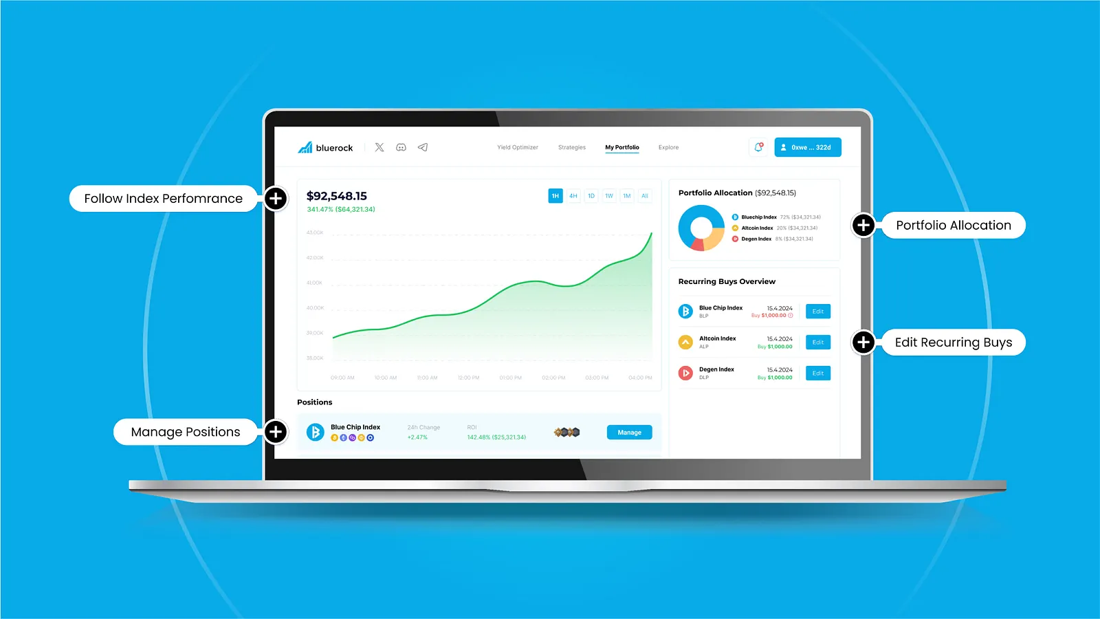
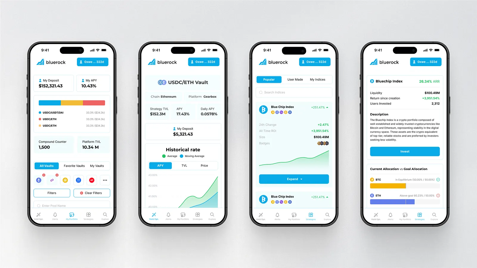
Crypto index investing was too complex to explain with trading-terminal UI, so I designed it around weights, rule-based rebalancing and growth projections and delivered a complete UI and design system before the product stalled on funding.
Role
Founding Product Designer
Dates
Client project
Team
Product, engineering and the client
Impact
- No usage numbers: the product did not ship. Funding and technical limits stopped it before launch.
- The client got the full investing flow, from choosing an index to recurring buys and governance votes, with a design system in light and dark modes, ready to build.
Problem
Most crypto products assume you want to pick tokens and manage a portfolio by hand. Bluerock wanted the opposite: curated indices with target weights, rule-based rebalancing when a weight drifts past a threshold, and optional yield that compounds or can be claimed. The design problem was explaining that behaviour to people who are not traders without turning the interface into a terminal. There were too many coins to evaluate one by one, token-level detail pushed people toward short-term trading, and compounding and governance rebalancing felt opaque. The product started at concept stage with no UX conventions to lean on, and it had to work on desktop and mobile.
- Index products work best when they show allocation structure, not price noise
- People understand a portfolio faster through weights than through token feeds
- Rule-based behaviour builds trust because outcomes feel predictable
Decisions
1. Show weights instead of token price feeds
Some of the team wanted live prices and performance for every underlying asset on the index screens, which pulls attention to short-term movement and makes an index feel like a trading terminal.
I argued against it after reviewing how index and ETF products present themselves: allocation and structure, not constant market movement. The main surfaces show percentage weights and how allocation works. People who want token-level detail get a link to a full asset list.
Made against the founders' preference at the time.
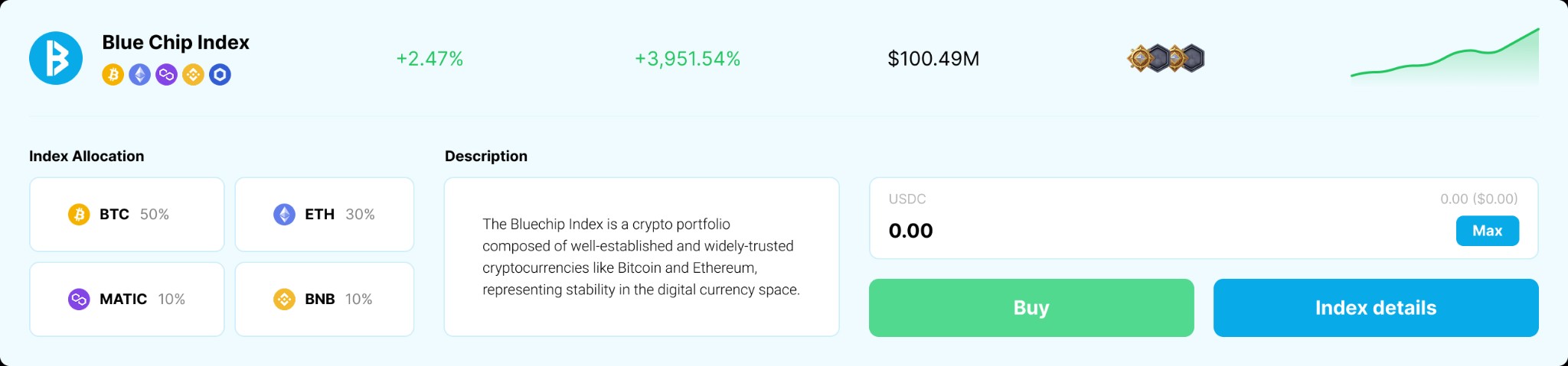
Evidence. Index and ETF products abstract token-level price noise for the same reason. The interface stayed focused on index behaviour.
2. Threshold-based governance rebalancing
Rebalancing had to feel predictable, and nobody could explain when or why an index would change.
I designed a rule: when an asset drifts more than ten percent from its target weight, the system opens a governance event, DAO participants propose rebalance plans and vote on execution.
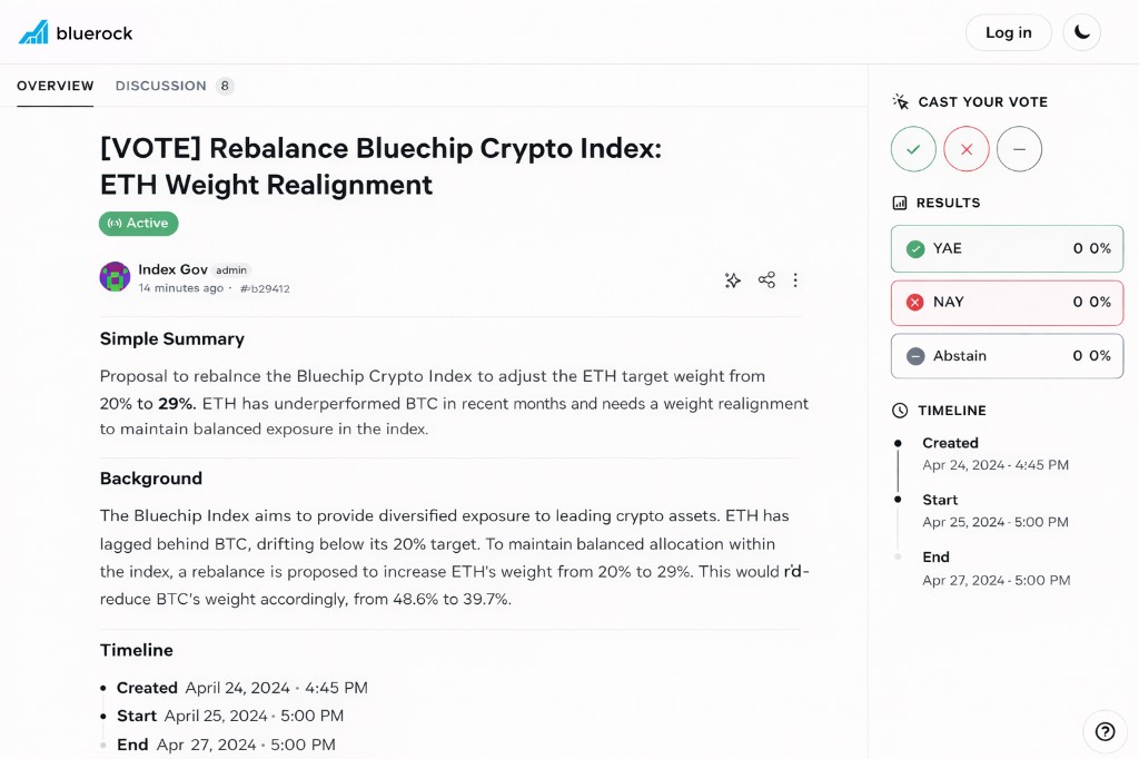
Evidence. Users could see when and why an index changed, tied to a measurable trigger instead of a discretionary call.
3. Explain compounding with a projection
Yield-bearing indices needed a way to explain compounding, and raw yield metrics intimidated people who had never used DeFi.
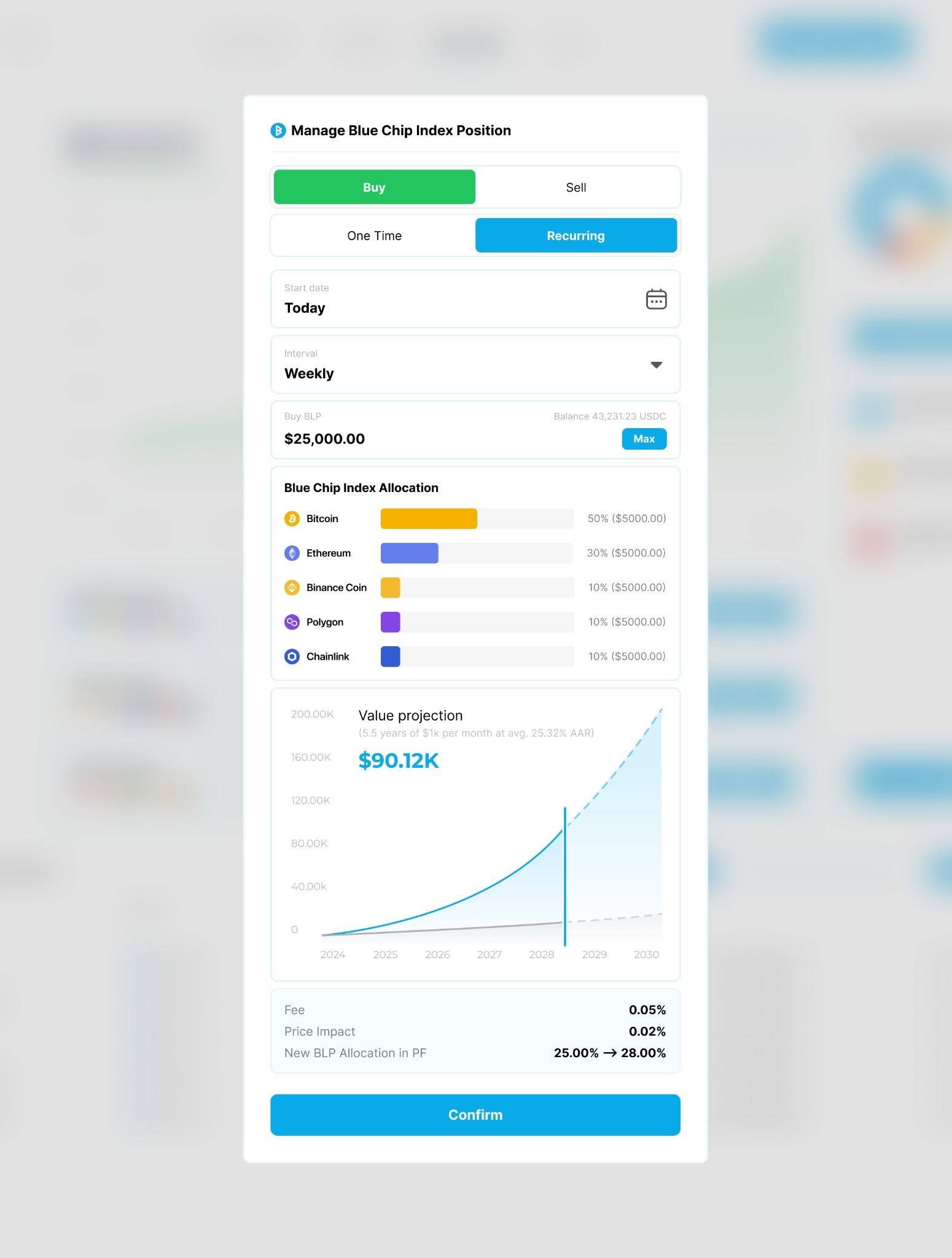
I took the projection model from Trading212 and adapted it: the manage-position dialog shows how reinvested yield changes the trajectory of an index over years, in familiar investing language.
Evidence. Traditional investing apps explain compounding through projections, not yield breakdowns. The projection is in the third screen above.
Reflection
- Structure has to be clearer than noise, or an index product turns into a trading app.
- Compounding has to be shown as an outcome people can picture.
- Governance UX only works when the rules are explicit.